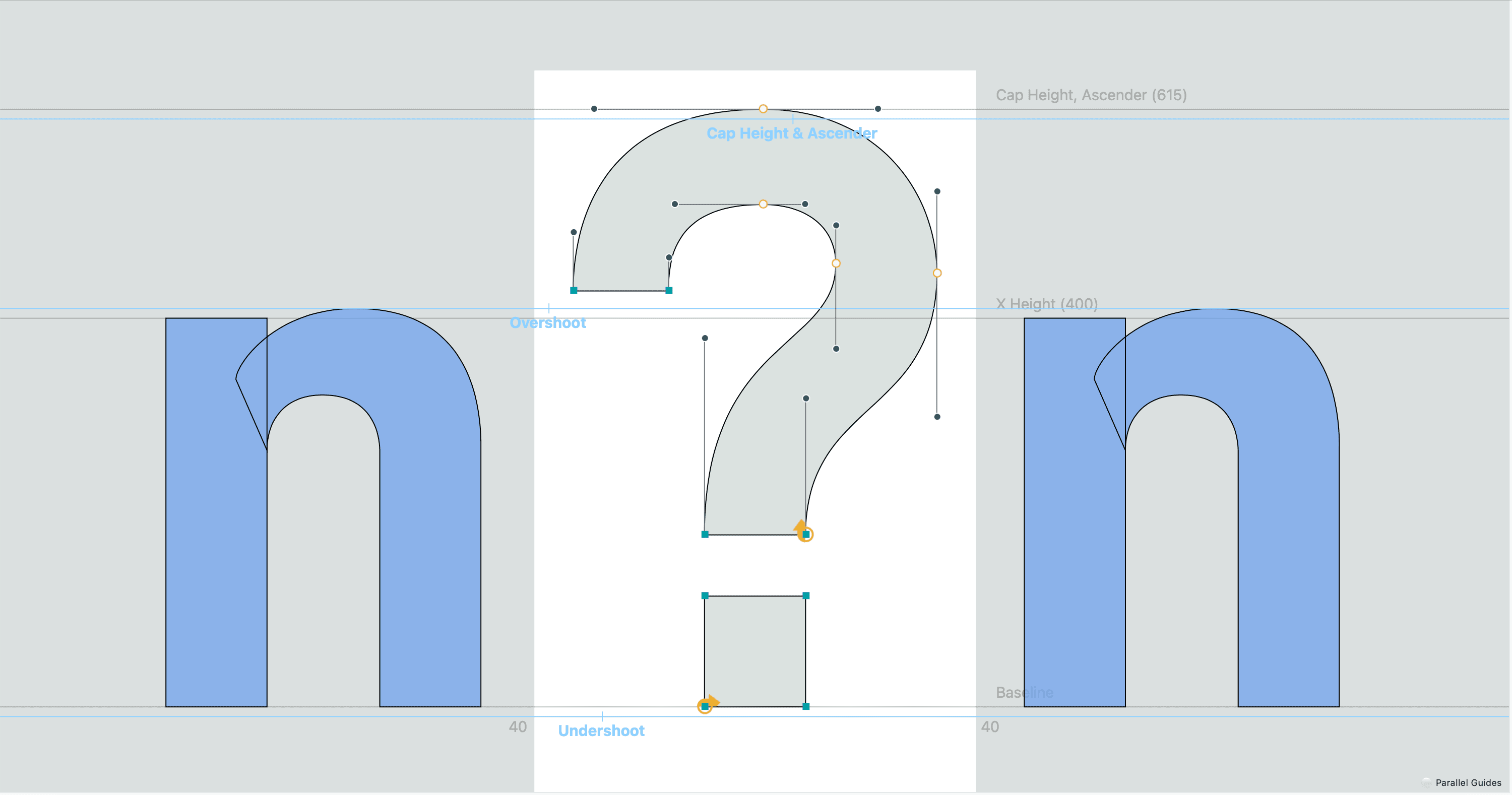
The goal was to create a revival typeface, utilizing an archived type specimen for a typeface that doesn't exist within the digital world. Objectives included learning new type design software, RoboFont, and paying close attention to the details that went into past typography.
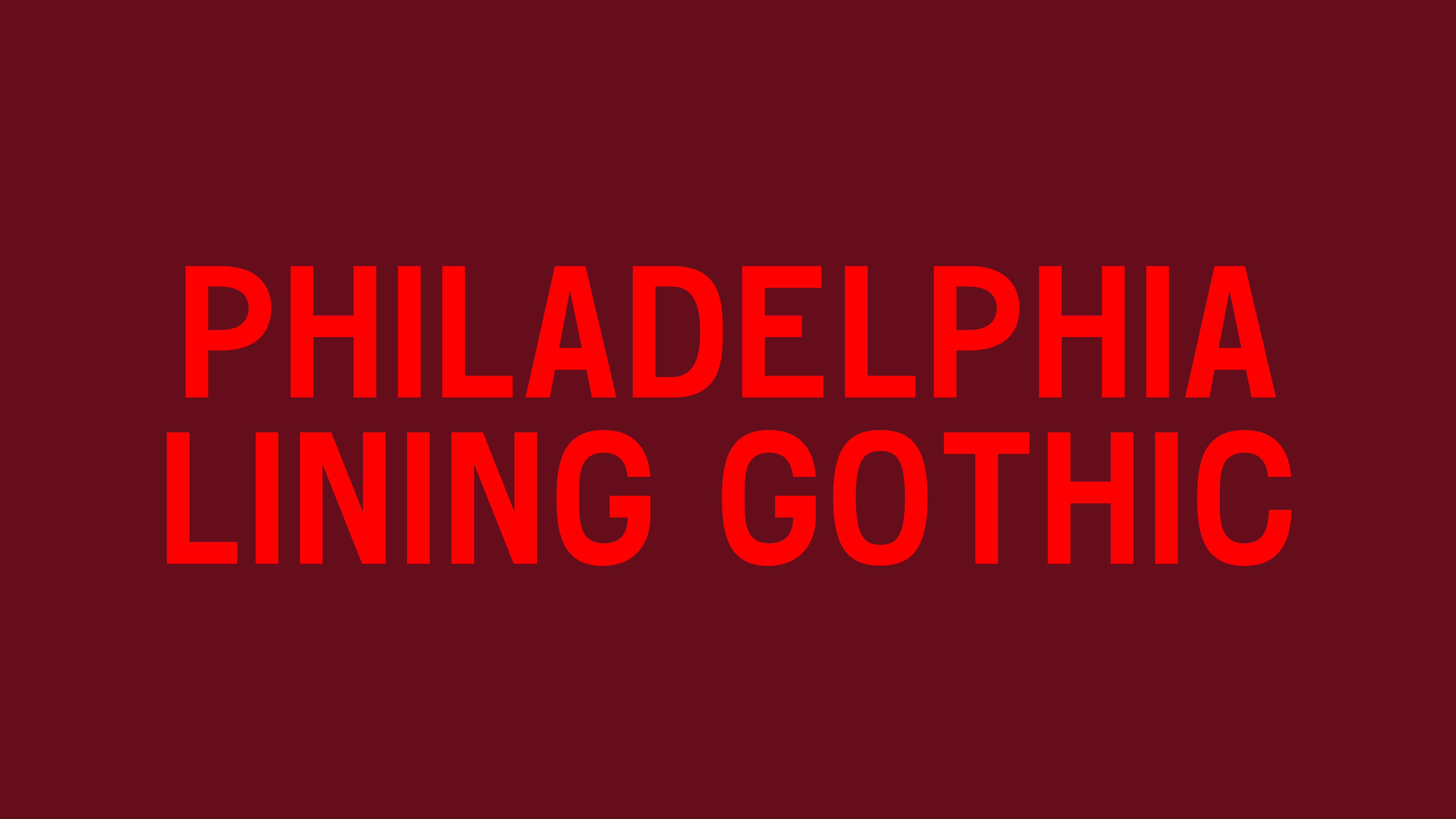
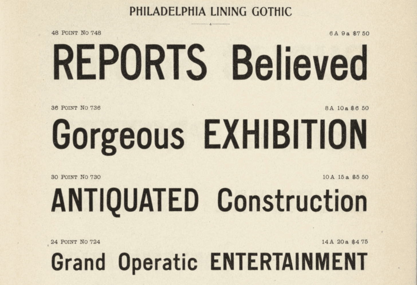
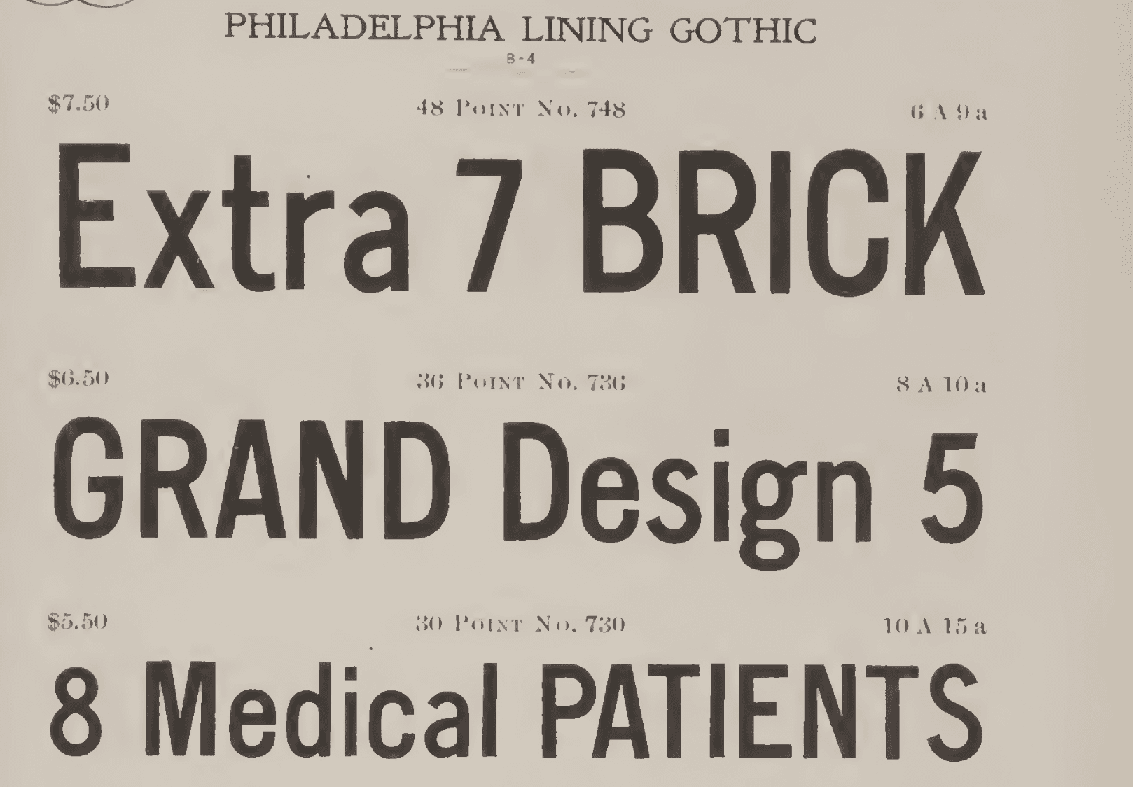
My approach was to create a revival for the typeface named Philadelphia Lining Gothic. This typeface was originally made by William W. Jackson and dates back to circa 1885. You can find this typeface in archived type specimens from the American Type Founders.
The goal was to create a revival typeface, utilizing an archived type specimen for a typeface that doesn't exist within the digital world. Objectives included learning new type design software, RoboFont, and paying close attention to the details that went into past typography.
My approach was to create a revival for the typeface named Philadelphia Lining Gothic. This typeface was originally made by William W. Jackson and dates back to circa 1885. You can find this typeface in archived type specimens from the American Type Founders.